The most common type of theme map is a choropleth map. When geospatial data is linked to some enumeration units, they are extremely effective (Counties, provinces, districts, etc.). The distinct polygons inside a layer of a choropleth map have varying shades of colors signifying a specific property of that polygon (in our case, the number of locations). We’ll make a choropleth map for the United States, with each state’s color graded proportionately to its number of sites.

The main steps for developing the Choropleth map are:
- Importing the polygon vector map.
- Importing the CSV file as a point vecto
- Calculating the number of locations inside each state using the ‘Count points in’ tool.
- Editing the symbol for getting the Choropleth map
- Exporting map as an image or PDF.
Importing Polygon Vector Map
To create a Choropleth map, we must first obtain a country/region polygon vector map. A state in the United States is represented by each polygon in the vector map. Extract data from zipped folder by downloading the compressed shapefiles. By double-clicking on the.shp file in the Browser toolbar, you can add it to QGIS (or dragging and dropping).

Importing The CSV File As A Point Vector
For this blog, we will use the entire list of Subway store locations in the United States. This information will contain every store’s latitude and longitude coordinates, which can be plotted as a point over the map.
Every record in the CSV file has fields named Latitude and Longitude, based on which we can plot the points. Click on the Layers tab from the main toolbar, then select addLayer>Add Delimited Text layer

In the ‘data source manager’ window that will pop up, browse the CSV file as the file name. Choose the Longitude and Latitude as X field and Y field, respectively. You will also need to select the respective Geometry CRS (Coordinate Reference System) depending on the location or country used.

The Add button overlays the polygon layer with the various retail outlets from the CSV as points. As you can see, the layer looks like this:

Calculating The Number Of Locations Within Each State Using ‘Count Points In Polygon Tool’
The QGIS tool ‘Count Points in Polygon’ can be used to represent the number of locations within each state. This tool created a single polygon vector shapefile with the ‘NUMPOINTS’ attribute. It tells you how many points are in a polygon.
Count Points in Polygon may be found under the Vector toolbar> Analysis tools > Count Points in Polygon.

The window below appears. Set the data placement point vector file to ‘Points’ and the polygon shapefile layers to ‘Polygons.’ The polygon shapefile will be given the attribute ‘NUMPOINTS,’ which refers to the number of places inside each state.

A layer mask called ‘Count’ is created and displayed in the layers tab as well as the image canvases area:

Editing The Symbology To Get A Choroh2leth Map
The symbolism of the new layer can be tweaked to provide an appropriately graded color that denotes the number of places in each condition. Go to the Symbology tab by right-clicking the Count layer and selecting properties.

Check out the symbology menu, select ‘Categoriazed’. Set the ‘value’ of symbology to the newly created attributes ‘NUMPOINTS’. Click ‘Classify’ and then select the appropriate color ramp.

After editing the symbology, the map will appear as:

On the map, each state can be identified with its appropriate name. Go to the Labels tab by right-clicking the Count layer and selecting properties.

Select ‘Single Labels’ as from the label menu, then the table’s ‘Value’ field as that of the label. Each polygon is labeled with the state’s ‘NAME.’ Set the font, color scheme, font size, opacity, and other parameters to your preference.
As you can see, the completed map looks like this. States with a greater number of sites of the particular provider considered are represented by darker tones of blue.

Export The Map As An Image Or PDF
Visit project>Import/Export>Export as Image for png format or Export as PDF to achieve the final map in PFG format.

The above Choropleth is used to compare every state based on the number of subway stores in it.
But it is comparable to the population choropleth of the United States.

Choropleth For Number Of Subway Stores
This is because of the number of retailers for each state is frequently significantly associated with the population, i.e., states with more people will have more stores. We may calculate a new statistic called “the per capita” locations by the state to gain a more understanding of choropleth. The sufficiency of a state’s stores is represented by this variable. Even if a state’s population is bigger, the number of stores it has maybe lower.
The number of sites per person (per capita) in each state in the United States is visualized.
Following the procedures below, we may construct a choropleth of per capita subway locations using population data:
- Make a CSV file with the necessary population data.
- QGIS should be used to import the CSV file.
- Join the population data to the map layer’s attribute table.
- Calculate the number of sites per individual using field calculations.
- Using the new statistic, create a choropleth map.
Create A CSV File Of Required Population Data
The Census Bureau’s website provides access to the United States’ population data. Each state’s population estimates for the years in question are included in the excel file. A new file can be created with the name of the state and its population projections for 2019.

The New File Is:

Assuring that the population column type is the ‘Number’ so that QGIS will read the field as number type and then, the analysis could be done depending on the population. Select the population column> Right-click> Format cells, and check if the category is the number. Save the file in CSV format.
Importing the CSV file to QGIS
To Import The CSV To QGIS
Select layer>Add layer > Add delimited Text Layer

The CSV File Added To QGIS Without The Use Of Geometry Appears As A Table In QGIS:

Right-click the new table layer-population_us_2019>open attribute table to see the content of the layer:

Join the Population Information with Attribute Table of The map Layer
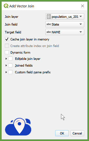
To join the population data to the ‘count’ layer. Right-click on the “Count” layer>Properties>Joins>Click Add icon

Choose ‘Join Layer’ for the population table. Choose ‘Join field’ from the population table and ‘Target field‘ from the map layer. Ensure that the names in each tier are the same. Fields that aren’t compatible will not be combined.
Open the attribute table of the “Count” layer and ensure if a new field is added to the attribute table with population estimates of every state.

Perform Field Calculations To Get The Per Capita Number Of Locations
The per capita number of locations can be calculated using the attribute table’s division function. The number of locations (NUMPOINTS) and the population (population us 2019 Population) are represented by two columns in the attribute table of the ‘Count’ layer. To find out how many locations each person has in each state;
Right-click on the ‘Count’ layer>Open attributes table>Click Open field calculator icon from the menu bar.

Choose to make a new field from the popup that appears. The computation result is stored in a new column in the attribute table. Choose an Output field type and a name for the output field. Because the population was so large in comparison to the number of places, a decimal number (real) was chosen, as well as a greater precision value. Provide the equation ‘NUMPOINTS / population_us_2019_Population‘ below the Expression tab and click OK.

A new column, locations_per _person, has been added to the attribute table. This number represents an estimate of how many sites are available per person in each state. The new choropleth map is created using this value.

Make A Choropleth Using The New Statistic.
As previously said, modify the symbology of the ‘Count’ layer, this time assigning ‘locations per person’ as the ‘Value’ for symbology.

The latest Choropleth for the number of subway stores per person by state is as achieved:


Contact LocationsCloud for any kind of Research analysis and report!!!